Visual Tools based on Citizen Data for improving the Communication of Severe Weather Events
This template is provided by OpenElement and was made in partnership with Sensode.
A complete FAQ is available describing various elements composing it (see the FAQ page in the Site Explorer on the left).
In case of questions, please visit the forum.
This text block can safely be removed and will not appear on the page.
A complete FAQ is available describing various elements composing it (see the FAQ page in the Site Explorer on the left).
In case of questions, please visit the forum.
This text block can safely be removed and will not appear on the page.

DSI Fellowship Program
Visual Tools Based on Citizen Data for Improving the Communication of Severe Weather Events
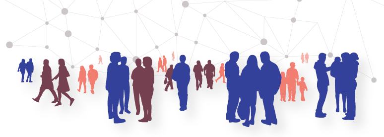
People tend to proactively participate in digital media, voluntarily and continuously generating enormous amounts of data, either geo-located items like photos, or other digital content of diverse kinds such as blog posts, tweets, and videos.
Some citizens, interested in particular subjects, participate in citizen science projects contributing with valuable input to solve diverse kind of problems related to environmental science, cultural heritage, astronomy, biology, just to mention a few.
All these kinds of data can be framed under the umbrella of participatory citizen science, and we named it here as citizen-data.
The main problems of Citizen-data are that they are very heterogeneous, unstructured, highly uncertain and subjective.
Data created by people having different backgrounds not necessarily experienced in advanced data recording and analytic tools, will lead to very dissimilar results.
Typical problems with these types of data are: ambiguity, contradictions, wrongly chosen categories, and unclear quantification.
These problems pose major challenges for assessing the quality of the data, and solving them by using purely automated and algorithmic approaches is not enough because it is currently computationally intractable to consider all possible hidden and yet essential features that citizens may have included in the data by only using algorithms.
We are a mixed group of computer scientists, geographers, cognitive scientists and meteorologists working together to tackle these challenges.
Digital Society Initiative
Project timeframe:
June 2020 to June 2021
Research Areas:
· Citizen Science
· Social Media Analytics
Research Institutions:
· University of Zurich
Stakeholders:
· MeteoSwiss
· Center of Research of the Sea and the Atmosphere
Funding:
· Digital Scociety Initiative
June 2020 to June 2021
Research Areas:
· Citizen Science
· Social Media Analytics
Research Institutions:
· University of Zurich
Stakeholders:
· MeteoSwiss
· Center of Research of the Sea and the Atmosphere
Funding:
· Digital Scociety Initiative

Dr. Alexandra Diehl
VMML IFI
Department of Informatics University of Zürich.
Department of Informatics University of Zürich.

Prof. Dr. Renato Pajarola
VMML IFI
Department of Informatics University of Zürich.
Department of Informatics University of Zürich.

Prof. Dr. Sara Fabrikant
GIVA
Department of Geography
University of Zürich.
Department of Geography
University of Zürich.

Prof. Dr. Claudio Tessone
Social Network Science
University of Zürich.
University of Zürich.

Dr. Oliver Grübner
GIVA
Department of Geography
University of Zürich.
Department of Geography
University of Zürich.

Dr. Manuel Mariani
Social Network Science
University of Zürich.
University of Zürich.
Dr. Juan Ruiz
CIMA
University of Buenos Aires.
University of Buenos Aires.

Dr. Ian Ruginski
GIVA
Department of Geography
University of Zürich.
Department of Geography
University of Zürich.
Exploratory Data Analysis
As a part of their master project in Computer Science, Fan, Kevin, and Yichun are working on the spatial fitting of tweets and weather radar data, performing automated text analytics and visualization of weather concepts, community detection based on weather concepts and network analysis.

Ms Fan Feng
Computer Science
Department of Informatics University of Zürich.
Department of Informatics University of Zürich.

Ms Yichun Xie
Computer Science
Department of Informatics University of Zürich.
Department of Informatics University of Zürich.

Mr Kevin Steijn
Computer Science
Department of Informatics University of Zürich.
Department of Informatics University of Zürich.
The goals of this MSc project are to (1) built-up visual components for the visual analysis and exploration of social media data, in particular Twitter data, and (2) and to develop data analytics tools such as data simplification and clustering methods identify potential social networks and keywords related to a specific high impact weather event.
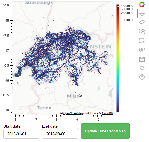
For example, a case study could consist on visualizing the weather radar data of a hail event or heavy storm over Switzerland on the map, then identifying all the tweets corresponding to the affected geographic area and visualizing the tweets, so that the analyst user can see the density distribution of tweets over the map (dot density map, for example). The user might want to look at the related topics, keywords present in the data and rank them. Additionally a node-link visualization could show the user all the identified social networks corresponding to these tweets. The visual tool should allow for an ”interactive visual analysis” and ”exploratory data discovery” process.
For example, a case study could consist on visualizing the weather radar data of a hail event or heavy storm over Switzerland on the map, then identifying all the tweets corresponding to the affected geographic area and visualizing the tweets, so that the analyst user can see the density distribution of tweets over the map (dot density map, for example). The user might want to look at the related topics, keywords present in the data and rank them. Additionally a node-link visualization could show the user all the identified social networks corresponding to these tweets. The visual tool should allow for an ”interactive visual analysis” and ”exploratory data discovery” process.
User Steerable Tools for the Analysis of Weather Concepts and Weather Experts
As part of this project, Seungwoo and Silvan are developing visual tools to understand weather key stakeholders behavior from Social Media Data.
The MSc project is structured into the following main tasks:
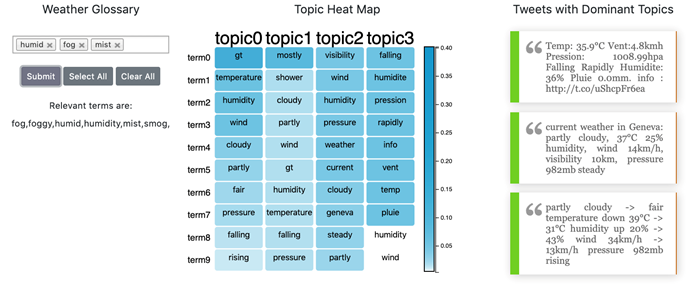
• Taxonomy of weather concepts. We will perform a semi-automated text analysis to extract non-expert weather concepts from citizen data including Twitter, and other weather forums using a combined approach of Open Coding and automated text analytics. Resulting concepts and their associated tweets should be bounded. Weather concepts will be visualized into a taxonomy by using node-link diagrams and hierarchical visualization. The taxonomy of concepts should be exported into a JSON file for further analysis. The system should allow for opening and visualizing saved weather concept taxonomies. The interactive visual analysis components should allow for the rearrangement of the taxonomy of weather concepts.
Optionally, it should also allow the user to create new weather concepts and group weather concepts into new concepts, modify concepts, and delete them from the hierarchy.
• Severe Event Classification. We will classify each tweet into two classes: severe weather event (1), not severe weather event (0). For this classification, we will consider the geospatial and temporal behavior of the data, and other situational information, and we will compare it with authoritative data, for example, weather radar data.
• Visualization of discoverers and extended social networks. The system should visualize the discoverers and their extended network by using a node-link diagram or other network-like visualizations. Tweets details should be provided on-demand.
The MSc project is structured into the following main tasks:
• Taxonomy of weather concepts. We will perform a semi-automated text analysis to extract non-expert weather concepts from citizen data including Twitter, and other weather forums using a combined approach of Open Coding and automated text analytics. Resulting concepts and their associated tweets should be bounded. Weather concepts will be visualized into a taxonomy by using node-link diagrams and hierarchical visualization. The taxonomy of concepts should be exported into a JSON file for further analysis. The system should allow for opening and visualizing saved weather concept taxonomies. The interactive visual analysis components should allow for the rearrangement of the taxonomy of weather concepts.
Optionally, it should also allow the user to create new weather concepts and group weather concepts into new concepts, modify concepts, and delete them from the hierarchy.
• Severe Event Classification. We will classify each tweet into two classes: severe weather event (1), not severe weather event (0). For this classification, we will consider the geospatial and temporal behavior of the data, and other situational information, and we will compare it with authoritative data, for example, weather radar data.
• Visualization of discoverers and extended social networks. The system should visualize the discoverers and their extended network by using a node-link diagram or other network-like visualizations. Tweets details should be provided on-demand.

Mr Seungwoo Han
Computer Science
Department of Informatics University of Zürich.
Department of Informatics University of Zürich.

Mr Silvan Wehrli
Computer Science
Department of Informatics University of Zürich.
Department of Informatics University of Zürich.
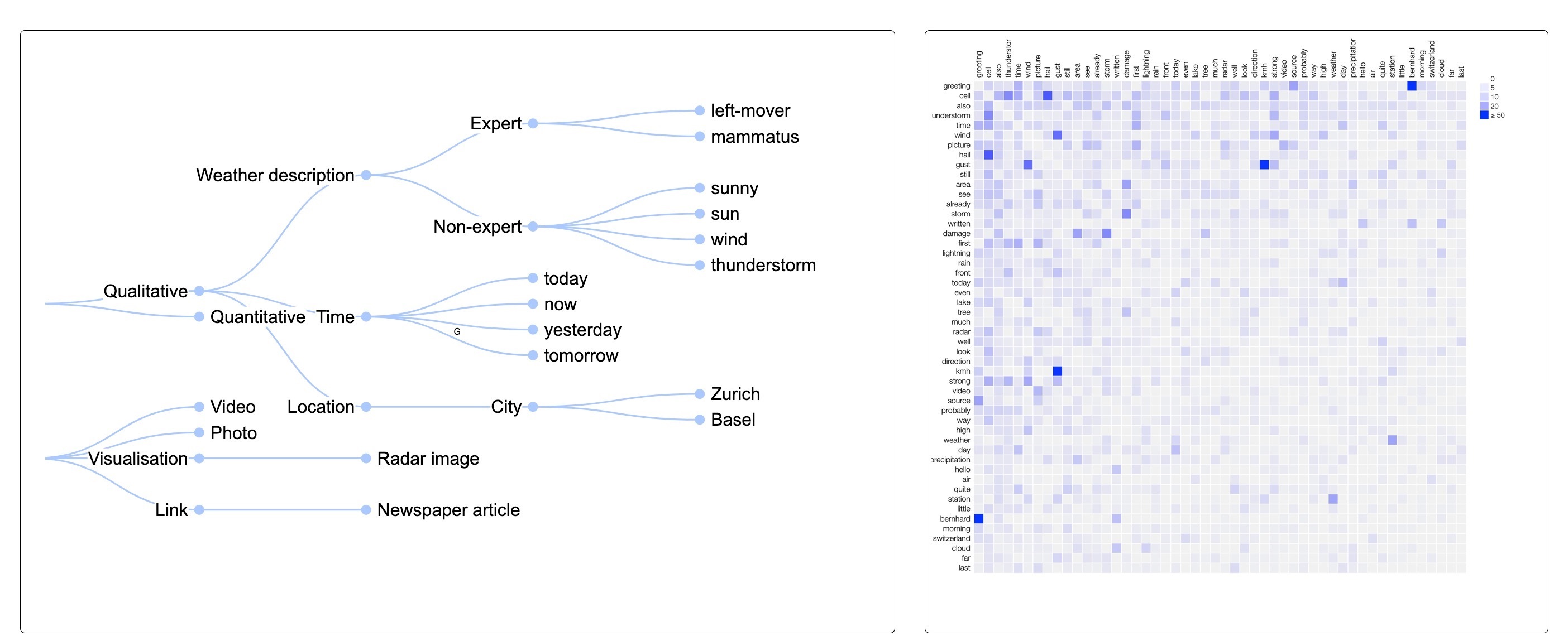
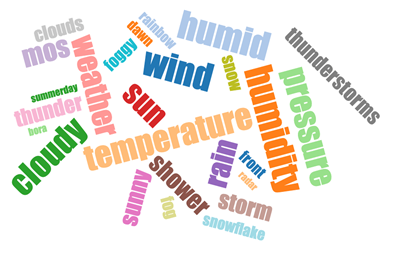
Taxonomical analysis of weather related terms from a weather entusiasts' discussion forum.
Severe Weather Communication
Effective communication of weather hazards to the general public is key to prevent and mitigate negative outcomes from weather hazards. Currently, there are many approaches to weather forecast visualization, such as contour and thematic maps that communicate forecast information about specific geographic regions.
However, sometimes the visual encodings are difficult to grasp and do not follow the best practices in visualization research, such as utilizing visual encodings that are difficult or time-consuming for nonexperts to interpret.
In this project, we want to experiment with different visual metaphors based on previous work on cognitive science that show the benefit of some visual encoding over others, to make the communication of weather hazards, and in particular, their associated uncertainty and inherent risk more effectively to non-experts.
Ananya is doing his master thesis in this topic, helping us to understand the best visual encoding for communicating weather hazards visually.

Mr Ananya Pandya
Computer Science
Department of Informatics University of Zürich.
Department of Informatics University of Zürich.

News 02
Reco
News 03
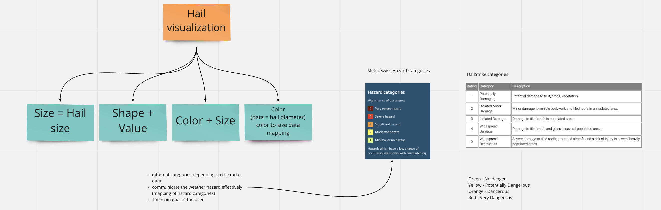
Use of different visual encoding and visual design choices to communicate severe weather events.
CONTACT
Want to know more? You can contact us by using this form.
CONTACT ADDRESS
diehl@ifi.uzh.ch
Tél : +41 44 635 71 36
University of Zurich
Binzmühlestrasse 14
CH-8050 Zürich
Room BIN 2.C.03
diehl@ifi.uzh.ch
Tél : +41 44 635 71 36
University of Zurich
Binzmühlestrasse 14
CH-8050 Zürich
Room BIN 2.C.03
send
©2020 - OPENELEMENT. TEMPLATE directed by SENSODE
